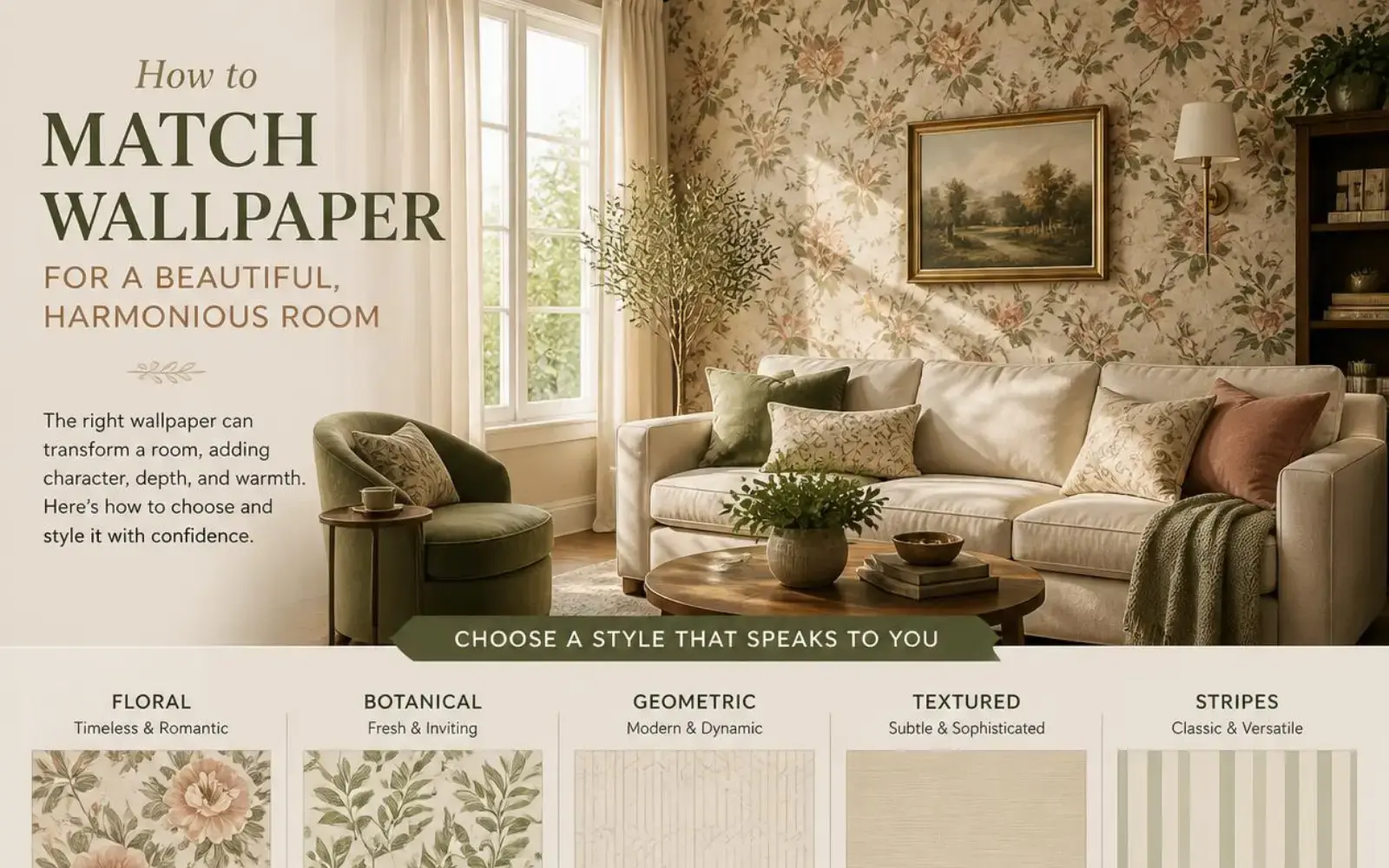
Choosing the right room wallpaper can completely transform the appearance of your home. However, wallpaper does not work independently. Its colour, pattern and texture interact with your furniture, curtains, flooring, lighting and other decorative elements.
The goal is not to make every element look identical. Instead, a well-designed room should have a sense of visual connection and balance. Current interior-design guidance increasingly focuses on coordinating colours, textures and patterns rather than creating perfectly matched sets.
At Ezy Glide, we believe great interiors come from thoughtful coordination, not guesswork. Whether you are decorating a living room, bedroom, dining area or home office, the right combination of room wallpaper, furniture and curtains can create a sophisticated and comfortable environment.
Why Coordinating Room Wallpaper Matters More Than Individual Choices
It is advisable to avoid selecting room wallpaper, furniture, and curtains independently based solely on individual appeal. Instead, it is important to consider the room as a cohesive entity, as it is perceived holistically rather than through isolated elements. Poor coordination can make a room feel:
- Visually disorderly or “busy,” even if each item is beautiful on its own
- Unbalanced, with one element overpowering the rest
- Dated quickly, as clashing trends compete for attention
Getting the coordination right, on the other hand, creates a space that feels calm and intentional and is considered a hallmark of good interior design.
Step 1: Choose Your Primary Piece First
Before selecting room wallpaper, decide which element will “lead” the room’s design. This is usually the piece that’s hardest or most expensive to change.
If you already have furniture: Let your sofa, rug, or statement furniture piece guide your wallpaper and curtain choices.
If you’re starting from scratch: Wallpaper can act as the main focus, with furniture and curtains selected to complement it.
Having one clear anchor prevents the common mistake of every element competing for attention.
Step 2: Build a Cohesive Colour Palette
Colour coordination is the single most important factor in making wallpaper, furniture, and curtains feel like they belong together.
The 60-30-10 Rule
A simple, designer-favoured approach to balancing colour in a room:
| Proportion | Role | Example |
| 60% | Dominant colour | Wallpaper or wall colour |
| 30% | Secondary colour | Furniture (sofa, curtains) |
| 10% | Accent colour | Cushions, art, décor accessories |
Using this ratio prevents any single colour from overwhelming the room while still creating visual interest.
Matching Undertones
Colours with mismatched undertones (warm vs. cool) can clash even if they seem similar at first glance.
- Warm undertones: cream, beige, terracotta, mustard
- Cool undertones: grey, blue-based whites, silver, icy pastels
Try to keep room wallpaper, furniture, and curtains within the same undertone family for a naturally harmonious look.
Step 3: Balance Pattern and Texture
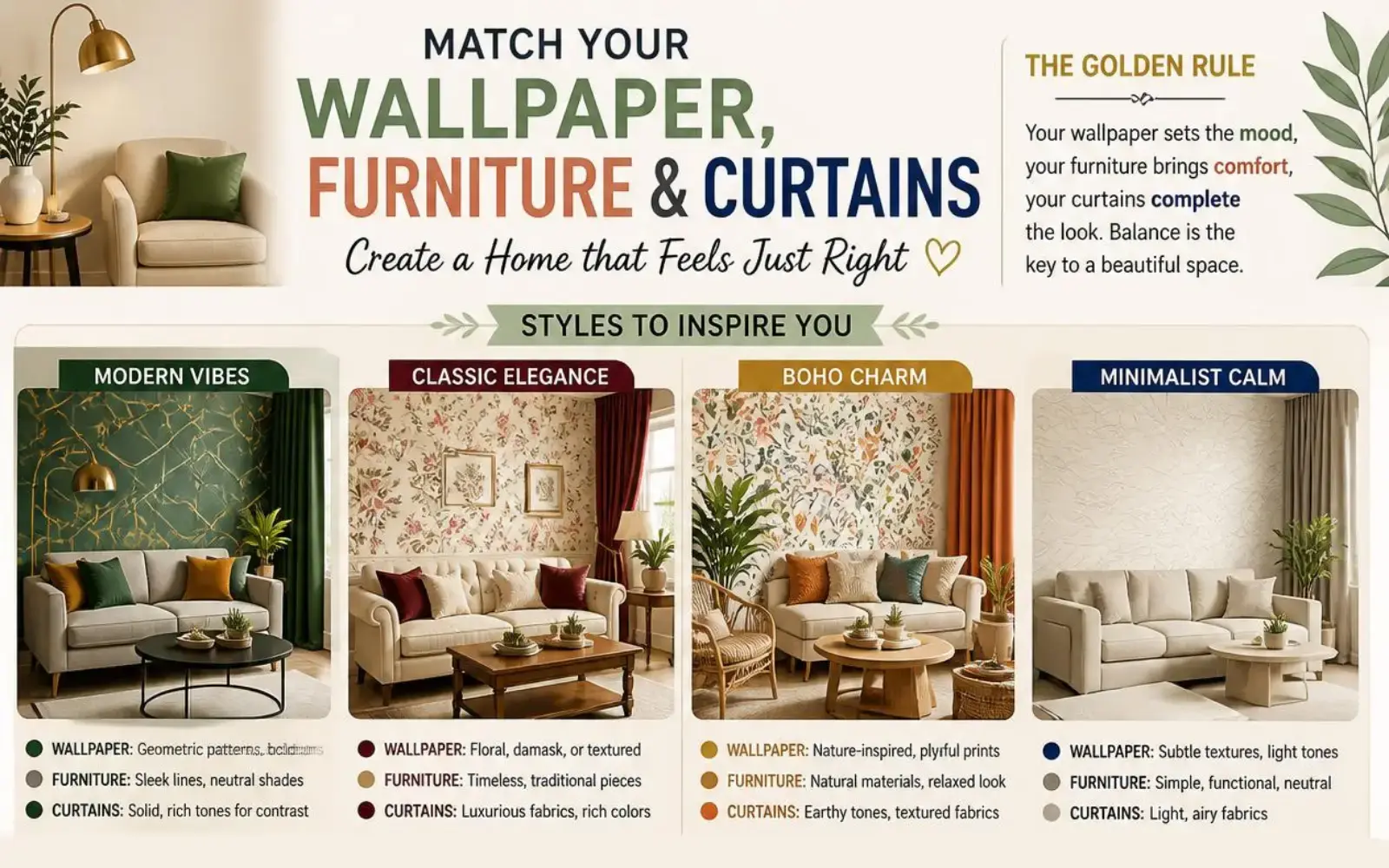
If your room wallpaper features a pattern, your furniture and curtains generally shouldn’t compete with equally busy patterns.
| Wallpaper Style | Furniture & Curtain Approach |
| Bold, large-scale pattern | Solid or subtly textured furniture and curtains |
| Small-scale or subtle pattern | Can be paired with light patterned textiles |
| Textured, plain wallpaper | More freedom to introduce patterned curtains or furniture |
| Striped or geometric wallpaper | Best paired with solid, softly textured fabrics to avoid visual clutter |
A good rule of thumb: if the room wallpaper is the “loud” element in the room, let curtains and upholstery stay quieter and vice versa.
Step 4: How to Match Curtains with Room Wallpaper
Curtains are one of the largest fabric surfaces in a room, so they play a major role in tying room wallpaper and furniture together.
- Select a colour directly from the wallpaper: Choosing a curtain shade that complements a secondary colour in the room wallpaper pattern creates a natural connection.
- Use neutral curtains as a buffer: If both your wallpaper and furniture are patterned or bold, neutral curtains can help balance the room.
- Consider fabric weight and light: Sheer curtains let more wallpaper be visible, creating a lighter, more open appearance, while heavier curtains add contrast and grounding to the space.
Step 5: Don’t Forget Function Including Curtain Motor Options
While matching aesthetics is important, curtains also need to perform well in the space. This is where practical upgrades, like a curtain motor, become worth considering, especially in rooms with statement wallpaper you want to keep looking its best.
Benefits of pairing your curtain setup with a curtain motor include:
- Consistent light management: Scheduled opening and closing helps protect room wallpaper from prolonged direct sunlight, which can cause fading over time.
- Convenience for large or heavy curtains: Rooms with tall windows or heavy drapery benefit from motorised, effortless operation.
- Clean, cord-free aesthetics: A curtain motor removes visible cords, keeping the visual line of your curtains and the wallpaper behind them uncluttered.
If you’re investing in a beautifully coordinated room, protecting that investment with smart, functional curtain solutions is a natural next step.
Step 6: Test Before You Commit
Before finalising your wallpaper, furniture, and curtain choices, always test them together in the actual room.
- Order wallpaper and fabric swatches rather than relying on screen colours alone
- View swatches in both natural daylight and evening artificial light
- Pin swatches to the wall alongside furniture fabric samples to see how they interact
Small samples can look different at full scale, so where possible, view larger swatches or sample boards before committing to full rolls or yardage.
Common Mistakes to Avoid
- Matching everything too literally: Identical colours across wallpaper, curtains, and furniture can feel flat rather than cohesive.
- Ignoring undertones: Two “neutral” tones with different undertones can clash more than expected.
- Overloading pattern: Combining bold wallpaper, patterned curtains, and patterned upholstery often overwhelms a room.
- Forgetting scale: Large-pattern wallpaper in a small room (or vice versa) can throw off the room’s proportions.
Quick Reference Checklist
- Anchor piece identified (wallpaper or furniture)
- Colour palette follows a 60-30-10 balance
- Undertones matched across wallpaper, furniture, and curtains
- Pattern intensity balanced bold wallpaper paired with quieter textiles, or vice versa
- Curtain colour and weight complement the wallpaper
- Curtain motor considered for light protection and convenience
- Swatches tested in-room under different lighting conditions
Final Thoughts
Matching room wallpaper with your furniture and curtains isn’t about finding an exact match, it’s about creating balance through colour, pattern, texture, and function. By choosing an anchor piece, coordinating undertones, and thoughtfully layering pattern and texture, you can create a room that feels cohesive and intentional rather than accidental.
At Sketch Art, we help you bring every element of your room together, from curtain fabrics to smart curtain motor solutions that protect your design investment and simplify everyday living. Explore our range to find the finishing touches your space deserves.